Football crests are strange little things. They sit quietly on shirts, programmes, scarves, and murals, rarely questioned, rarely analysed, yet they carry entire worlds inside them. A crest is a shorthand for identity, a symbol that gathers history, memory, and meaning into a single image. For Celtic supporters, the badge is more than a logo, it is a story, a lineage, a reminder of where the club came from and what it has always stood for.
Celtic’s crest has changed shape over the decades, but its heart has remained remarkably consistent. Each version reflects not just a design choice, but a moment in the club’s evolution, a shift in culture, confidence, or circumstance. To trace the crest’s journey is to trace Celtic’s own evolution, from a charitable club founded for a community in need, to a global institution with supporters scattered across continents.
This is the story of that evolution, and what each crest has symbolised along the way.
Origins: The Irish Harp (1888–1890s)
Before Celtic had a crest, it had a purpose. Founded in 1887 to alleviate poverty among Glasgow’s Irish immigrant population, the club’s earliest visual identity wasn’t a badge at all, but the Irish harp. It appeared on early club documents, medals, and promotional materials, a clear and unmistakable declaration of cultural roots.
The harp is one of Ireland’s oldest national symbols, associated with poetry, resistance, and the endurance of a people who carried their culture across oceans. For the Irish community in Glasgow, many of whom had fled hardship only to face new forms of discrimination, the harp was a reminder of dignity and belonging.
Celtic’s adoption of the harp wasn’t a branding exercise, it was a statement of solidarity, a way of saying, this club is for you. The harp set the tone for everything that followed, a club grounded in charity, identity, and community.
The Birth of the Four‑Leaf Clover (1890s–1900s)
By the 1890s, a new symbol began to appear on Celtic’s kits and materials, the four‑leaf clover. It wasn’t yet a formal crest, but it quickly became the club’s most recognisable emblem.
The clover carried layers of meaning. It was Irish, of course, a nod to heritage, but it also represented luck, hope, and the idea of finding something rare and precious. For a young club built on aspiration and community pride, the symbolism fit perfectly.
The clover also resonated with the Irish diaspora in Scotland. It was simple, friendly, and instantly recognisable, a visual shorthand for belonging. While other clubs adopted heraldic shields or city crests, Celtic embraced something organic and humble, a leaf, a symbol of growth.
This early clover wasn’t polished or standardised, but it didn’t need to be. It captured the spirit of the club, rooted in heritage, carried by hope.
The Classic Circular Crest (1930s–1960s)
As football modernised, so did its visual language. By the 1930s, Celtic introduced a circular crest with the clover at its centre, the first version that resembles the badge we know today.
The circle was a deliberate choice. Circular crests were becoming popular across Europe because they were clean, symmetrical, and easy to reproduce. But the symbolism ran deeper. A circle represents unity, continuity, and community, values that had defined Celtic from the beginning.
Inside that circle sat the four‑leaf clover, now more stylised and consistent. The design balanced tradition with modernity, the clover kept the club’s roots intact, while the circle signalled a club stepping confidently into a new era.
This crest accompanied Celtic through decades of growth, domestic success, European competition, and the expansion of the club’s identity beyond Glasgow. It became the visual anchor for generations of supporters, many of whom would pass their love of the club down through families.
The circular crest wasn’t just a badge, it was a symbol of Celtic’s rising stature and enduring values.
The Lisbon Lions Era Crest (1960s)
Some symbols become powerful not because of how they look, but because of what happens while they’re worn.
The crest used during the 1967 European Cup triumph, a simple clover within a circle, is one of those symbols. When the Lisbon Lions lifted the trophy, becoming the first British team to win the European Cup, they didn’t just make history, they transformed the meaning of the crest forever.
From that moment on, the clover wasn’t just a nod to heritage, it was a symbol of possibility, of courage, of a team built from within 30 miles of Celtic Park conquering Europe with attacking football and unshakeable belief.
Supporters often talk about the Lisbon Lions with reverence, and the crest from that era carries that same aura. It is a reminder that greatness can come from homegrown roots, from community, from unity. The badge became mythic, a vessel for one of football’s most romantic stories.
The 1977 Knotwork Crest, A Bold Experiment
In 1977, Celtic made the most dramatic change in its visual history, the introduction of a Celtic knotwork crest. Inspired by ancient Irish art, the design featured intricate interlacing patterns forming a stylised clover.
The symbolism was rich. Knotwork represents eternity, interconnectedness, and the unbroken threads of heritage. It was a bold attempt to lean deeper into Celtic identity, embracing artistic traditions that predated the club by centuries.
But the crest was divisive. Some supporters loved its beauty and cultural depth, others found it too complex, too busy, too far from the simplicity that had defined the club’s imagery. On shirts, the detail often got lost. In an era before digital reproduction, the intricacy became a practical challenge.
The knotwork crest was short‑lived, but it remains a fascinating chapter, a moment when Celtic experimented with how to express its identity visually. It showed a club willing to explore its roots in new ways, even if the result didn’t endure.
The 1988 Centenary Crest, A Return to Roots
A century after its founding, Celtic marked the milestone with a redesigned crest that returned to the classic circular format. The 1988 centenary badge featured a refined clover, updated typography, and the dates “1888–1988”.
This crest wasn’t just a celebration, it was a reaffirmation.
The 1980s were a turbulent period for the club, and the centenary crest arrived as a stabilising symbol, a reminder of Celtic’s origins, values, and resilience. It honoured the past while signalling a desire to move forward with clarity and purpose.
Supporters embraced it. The centenary crest felt familiar yet fresh, traditional yet modern. It bridged eras, connecting the club’s founding principles with its future ambitions.
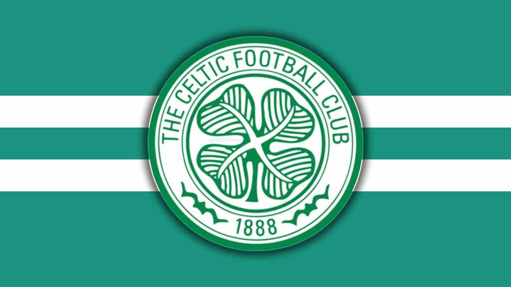
The Modern Crest (1995–Present)
In 1995, Celtic introduced the crest that remains in use today, a clean, minimalist circular badge with a stylised four‑leaf clover and the founding year, 1888, prominently displayed.
This crest reflects the realities of modern football. It is designed for clarity across digital platforms, merchandise, and global branding. Its lines are crisp, its shapes balanced, its symbolism unmistakable.
Yet despite its modernity, the heart of the crest remains unchanged. The clover is still central. The circle still represents unity. The inclusion of “1888” grounds the club firmly in its origins.
In an era when many clubs have radically rebranded, Celtic has chosen continuity. The modern crest is a reminder that identity doesn’t need reinvention, it needs preservation. It carries the weight of history while remaining adaptable to the demands of a global audience.
For supporters, the badge still means what it always has, community, charity, heritage, and pride.
What the Crest Means Today
Ask a Celtic supporter what the crest means, and you won’t get a design critique. You’ll get a story.
A memory of a first match at Celtic Park. A scarf handed down from a parent or grandparent. A tattoo inked to mark a moment of joy or resilience. A flag carried across oceans by fans who found belonging in a club thousands of miles from home.
The crest is a living symbol. It gathers meaning not from marketing departments but from the people who wear it, sing beneath it, and carry it into their lives. It represents a club founded for charity, shaped by community, and sustained by generations of supporters who see themselves reflected in its simple green lines
Closing Reflection
The evolution of the Celtic crest is a story of continuity more than change. While the shapes and styles have shifted, the heart of the badge has remained remarkably steady, a clover, a circle, a sense of belonging.
Symbols endure because they hold stories, and Celtic’s crest holds more than most. It carries the hopes of immigrants, the triumph of Lisbon, the resilience of difficult eras, and the pride of millions of supporters across the world.
A badge may be small, but the world inside it is vast. And for Celtic fans, that world is home.

Leave a comment